Bockfest is coming!

There are two weekends in Cincinnati you just can't miss. The first is MidPoint Music Festival, at the end of September. The second is Bockfest - a 21 year old weekend festival ushering the first signs of spring with goats, monks, and delicious beer -- and it's THIS weekend! (March 1-3!) --  Watch out for the girl in the captain's hat causing a ruckus - that will be me.

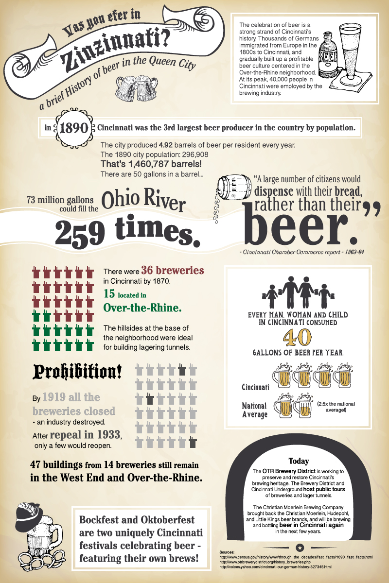
To get in the spirit, I'm sharing an infographic I created last year as a fun demonstration of skills for my previous employer. Get the facts on beer in the Queen City!


Diary of a DAAP Kid: The Importance of Portfolio

For most soon to be graduates, having a finely crafted Microsoft Word formatted resume crammed full with campus leadership positions and summer internship experience will be enough to land them in their desired post-college position.

Not so with the dedicated DAAP-er. Because the work we do is visual in nature, it is necessary to have a compiled selection of past school and paid work that is graphically pleasing. For those out of the loop, this is called a portfolio, and can be the bane of many student's existence. Now not only do the cover letters and resumes need to stand out, but the very way one's portfolio is arranged speaks volumes about one's design sensibilities, and yes... they will be judged.

I have successfully constructed a digital portfolio that is printed out into a booklet I can bring to interviews and discuss with potential employers, but it is also necessary to leave an impression upon meeting new design colleagues. I have been directing people to this blog, and today I am proud to say that it will be easy to access my online work as well as my writing and various outlets!!

Please, check it out and let me know what you think. I will eventually be adding my senior project work... as soon as it is complete!!

Late Night Rambles

It is late. I am overbooked with things to do. I'm taking two midterms in the next two days, neither of which I've studied adequately for. I'm incredibly behind in studio..

This is mostly because I redid my design. AGAIN. We're talking the sixth or seventh complete and utter redesign over the span of 14 weeks or so. But... I'm really happy with it. It's actually working out this time.

Remember how before I had random meaningless shapes as cutouts in my nook? Cool concept, boring execution. It needed meaning.

Enter meaning:

It's an anagram poem by the lovely and OTR-centered VisualLingual. So now my random shapes are lettters, that harken back to the neighborhood the library is centered in...

Just a screenshot of my Sketchup model, but you can get the idea, right? You won't actually experience the space like this, but it's cool to look at overall.

Yes.

Okay. Back to work!

Midterms!

I'm halfway through winter quarter. Instead of exams, students in my program put together a series of drawings to illustrate their design. It's definitely a halfway point, and I have a long way to go in my thoughts and ideas. I thought you might like to see what I've come up with so far.

The amorphous shapes in the middle of each floor represent the "nook" spaces developed for different groups of people. I think they're going to change, probably a lot.

Let me know what you think and if you have any ideas for improving my work!