I put up a tip on Reddit last night, and apparently it was quite helpful. So here's a bigger graphic and some attribution. P&G Fabric Care and related agencies, you're welcome. Hire my agency for more cool work.
Handy tips when doing lady laundry:
When you're switching clothes from the washer to the dryer, remember:
If it's Sexy, Stretchy, See Through, or Sheepish (wool) - hang it up to dry.
When in doubt, leave it out (of the dryer) - messing up/shrinking/ruining her bras, sporty stuff, and delicate clothing will put a sour note on your nice gesture.
BF and I came up with these rules when we moved in together- 9 months later and no ruined clothing!
It sparked quite the debate on gender roles, laundry care, and general puns/jokes/sexism that is the reddit community. In our house my boyfriend and I split household chores. He does laundry because I'm terrible at folding clothes. I cook, he does dishes, I tidy up and clean the bathroom.. it all works out in the end.
I just wanted to help out any guys that wanted to surprise their ladies with taking on a chore - so that the surprise is GOOD, and not full of tears and anger. No one likes ruined clothing.
Go forth and launder, for yourself or your loved ones... however you choose!


The reason that designers get frustrated with font choices like Comic Sans and Papyrus is because often times they are used in the wrong context. Comic Sans is a font that wasn't even originally supposed to be released for public use. It conveys a childish and immature tone, and isn't appropriate for formal or business use because it looks unprofessional. Using it in kindergarten class is one thing, putting it on a tombstone is another.
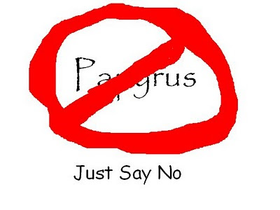
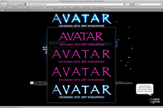
Papyrus is incredibly overused - it seems that any time a person wants to convey "natural" or "elegance" or "unique" in their signage, they turn to Papyrus. For a small business, or a wedding, or whatever - someone who might not know better, it's slightly more acceptable. It is less acceptable that a famous director with piles of money at his disposal and a team of incredibly talented artists chose something so generic and overused for his 10 year masterpiece.
I'm aware that it's "just" a font, and in the long run, it doesn't bring world peace, save malnourished babies, or solve health care reform in the US.
HOWEVER, it's something that's important to a lot of people, it's what I'm studying for my career, and I believe that good design makes the world better in its own small way. So don't knock it, or I'll never come over and pick out paint colors for you! ;)
So if you are a small business owner wanting to develop some personal business cards or a starry eyed bride-to-be dead set on designing her own wedding invites, please please please consider using another font before you run to Comic Sans or Papyrus!! In fact, you could just ask me and I will be happy to steer you in the right direction.
Two great downloadable font sites are www.dafont.com and www.1001fonts.com. I have been known to peruse these sites for hours, looking for a great font that is perfect for the mood I'm trying to convey. These fonts are created by newer designers and are usually available for free. They are divided up into different categories depending on whether you are looking for a script, a grunge font, or a sans serif (that is, without the little twirlies on the ends)
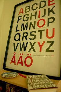
If you are just working with MS Word and want to mix it up from the default Times New Roman, try using Helvetica, Gill Sans, Cochin, or Book Antiqua.
CollegeHumor did a funny video about fonts. Check it out (and if you've been paying attention you'll understand why I was slightly disappointed at the ending)