I just completed a neat little side project I wanted to share with you today. Jennifer Jolley is a rockin' local composer whose modern opera "Krispy Kremes and Butter Queens" - a musical riff on Paula Deen - has performed across the country to rave reviews. (I'm not just saying that; I got to see it performed during the Fringe Festival this year! Check it.)
We met up in April so I could help her with a logo redesign. Jennifer is inspired by urban form and 80's nostalgia. I took some time and created a shared Pinterest board so we could collaborate on initial inspirations.
I sketched out a few options, but was really jazzed by the Space Invader urban art I saw in Europe last summer. The 8-bit pixel style was right up her alley, and the fact it was used in the cityscape made it a perfect fit.
\
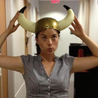
Jennifer has a great picture on her Facebook profile of her being silly in a Brunhilde style hat (oh, you remember that cartoon...). It's pretty iconic, so I went with it. It was fun to learn how do create pixel art in Illustrator, and after a few tweaks we came up with a fun, recognizable brandmark that she can use on her website, her business cards, and even on her music! I also helped with some font selection so that her work has a more consistent look and feel to it. We ended up choosing Pompiere for title fonts and Futura for body copy.
I love coming up with creative solutions for creative people.


